
Tutorial#
To demonstrate the use case of Matplotlib we will consider a particular set of data called Anscombe’s Quartet.
Problem
Consider the following 4 data sets:
x |
y |
|---|---|
10.0 |
8.04 |
8.0 |
6.95 |
13.0 |
7.58 |
9.0 |
8.81 |
11.0 |
8.33 |
14.0 |
9.96 |
6.0 |
7.24 |
4.0 |
4.26 |
12.0 |
10.84 |
7.0 |
4.82 |
5.0 |
5.68 |
10.0 |
9.14 |
|---|---|
8.0 |
8.14 |
13.0 |
8.74 |
9.0 |
8.77 |
11.0 |
9.26 |
14.0 |
8.1 |
6.0 |
6.13 |
4.0 |
3.1 |
12.0 |
9.13 |
7.0 |
7.26 |
5.0 |
4.74 |
10.0 |
7.46 |
|---|---|
8.0 |
6.77 |
13.0 |
12.74 |
9.0 |
7.11 |
11.0 |
7.81 |
14.0 |
8.84 |
6.0 |
6.08 |
4.0 |
5.39 |
12.0 |
8.15 |
7.0 |
6.42 |
5.0 |
5.73 |
8.0 |
6.58 |
|---|---|
8.0 |
5.76 |
8.0 |
7.71 |
8.0 |
8.84 |
8.0 |
8.47 |
8.0 |
7.04 |
8.0 |
5.25 |
19.0 |
12.5 |
8.0 |
5.56 |
8.0 |
7.91 |
8.0 |
6.89 |
For every data set obtain:
The mean and standard deviation of \(x\);
The mean and standard deviation of \(y\).
Plot a scatter plot of all 4 data sets of \(y\) against \(x\).
Find a regression line that for \(y\) against \(x\) and add a plot of that to the scatter plot.
We start this problem by creating tuples with values corresponding to each column of each data set:
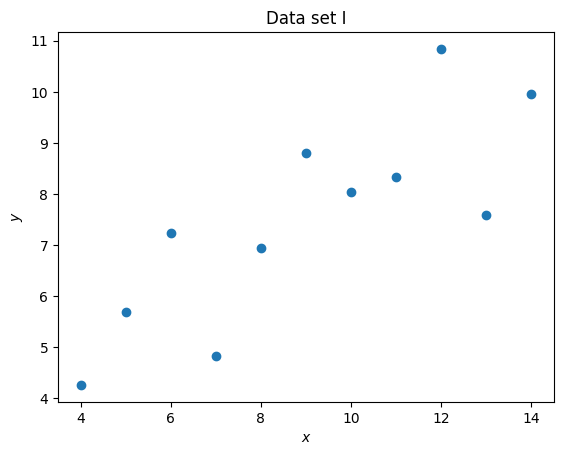
set_1_x = (10.0, 8.0, 13.0, 9.0, 11.0, 14.0, 6.0, 4.0, 12.0, 7.0, 5.0)
set_1_y = (8.04, 6.95, 7.58, 8.81, 8.33, 9.96, 7.24, 4.26, 10.84, 4.82, 5.68)
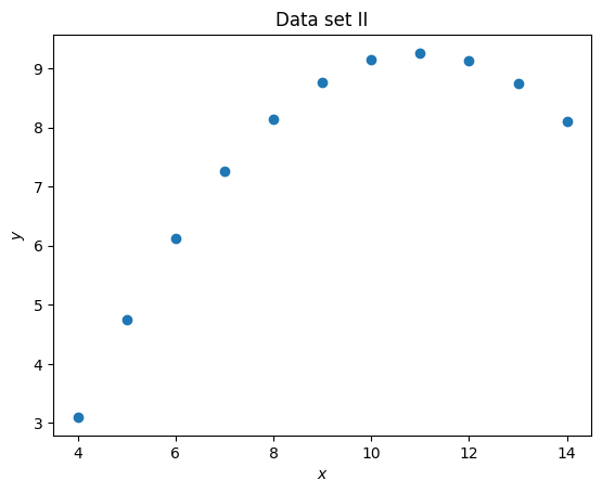
set_2_x = (10.0, 8.0, 13.0, 9.0, 11.0, 14.0, 6.0, 4.0, 12.0, 7.0, 5.0)
set_2_y = (9.14, 8.14, 8.74, 8.77, 9.26, 8.1, 6.13, 3.1, 9.13, 7.26, 4.74)
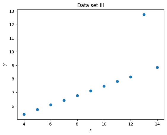
set_3_x = (10.0, 8.0, 13.0, 9.0, 11.0, 14.0, 6.0, 4.0, 12.0, 7.0, 5.0)
set_3_y = (7.46, 6.77, 12.74, 7.11, 7.81, 8.84, 6.08, 5.39, 8.15, 6.42, 5.73)
set_4_x = (8.0, 8.0, 8.0, 8.0, 8.0, 8.0, 8.0, 19.0, 8.0, 8.0, 8.0)
set_4_y = (6.58, 5.76, 7.71, 8.84, 8.47, 7.04, 5.25, 12.5, 5.56, 7.91, 6.89)
Now to compute the mean and standard deviation we will use numpy:
import numpy as np

for x in (set_1_x, set_2_x, set_3_x, set_4_x):
    print(np.mean(x), np.std(x))
9.0 3.1622776601683795
9.0 3.1622776601683795
9.0 3.1622776601683795
9.0 3.1622776601683795
We see that all the data sets have the same mean and standard deviation for \(x\).
for y in (set_1_y, set_2_y, set_3_y, set_4_y):
    print(np.mean(y), np.std(y))
7.500909090909093 1.937024215108669
7.50090909090909 1.93710869148962
7.5 1.9359329439927313
7.500909090909091 1.9360806451340837
Similarly for \(y\): all the data sets have approximately the same mean and standard deviation.
We will now use matplotlib to plot a scatter plot of all the data sets:
import matplotlib.pyplot as plt

plt.figure()
plt.scatter(set_1_x, set_1_y)
plt.title("Data set I")
plt.xlabel("$x$")
plt.ylabel("$y$");
import matplotlib.pyplot as plt

plt.figure()
plt.scatter(set_2_x, set_2_y)
plt.title("Data set II")
plt.xlabel("$x$")
plt.ylabel("$y$");
import matplotlib.pyplot as plt

plt.figure()
plt.scatter(set_3_x, set_3_y)
plt.title("Data set III")
plt.xlabel("$x$")
plt.ylabel("$y$");
import matplotlib.pyplot as plt

plt.figure()
plt.scatter(set_4_x, set_4_y)
plt.title("Data set IV")
plt.xlabel("$x$")
plt.ylabel("$y$");
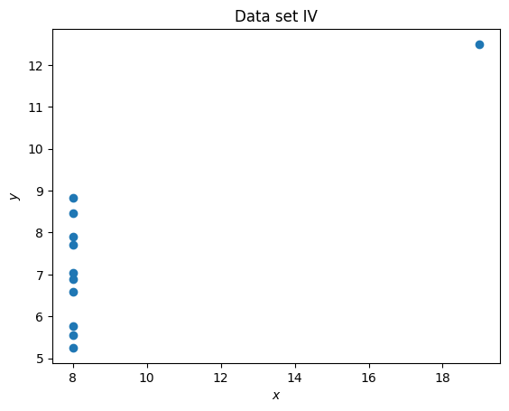
It is clear that despite having differing means and standard deviations, the data sets are different.
To fit a line of best fit we will using numpy.polyfit which fits a polynomial.
We specify that we want a line (so a polynomial of degree 1):
coefficients = np.polyfit(set_1_x, set_1_y, 1)
coefficients
array([0.50009091, 3.00009091])
Here are each of the coefficients for the lines of best fit for each data set:
for x, y in (
    (set_1_x, set_1_y),
    (set_2_x, set_2_y),
    (set_3_x, set_3_y),
    (set_4_x, set_4_y),
):
    a, b = np.polyfit(x, y, 1)
    print(a, b)
0.5000909090909094 3.000090909090908
0.5000000000000006 3.0009090909090883
0.49972727272727313 3.0024545454545453
0.49990909090909097 3.0017272727272717
All the coefficients are the same, we will go ahead and add a plot of them to each plot:
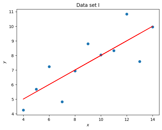
import matplotlib.pyplot as plt

x = set_1_x
y = set_1_y
title = "Data set I"

coefficients = np.polyfit(x, y, 1)
line_y = [a * x_value + b for x_value in x]

plt.figure()
plt.scatter(x, y)
plt.plot(x, line_y, color="red")
plt.title(title)
plt.xlabel("$x$")
plt.ylabel("$y$");
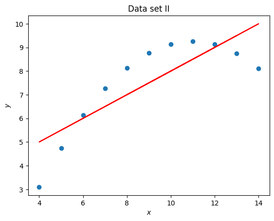
import matplotlib.pyplot as plt

x = set_2_x
y = set_2_y
title = "Data set II"

coefficients = np.polyfit(x, y, 1)
line_y = [a * x_value + b for x_value in x]

plt.figure()
plt.scatter(x, y)
plt.plot(x, line_y, color="red")
plt.title(title)
plt.xlabel("$x$")
plt.ylabel("$y$");
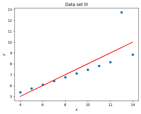
import matplotlib.pyplot as plt

x = set_3_x
y = set_3_y
title = "Data set III"

coefficients = np.polyfit(x, y, 1)
line_y = [a * x_value + b for x_value in x]

plt.figure()
plt.scatter(x, y)
plt.plot(x, line_y, color="red")
plt.title(title)
plt.xlabel("$x$")
plt.ylabel("$y$");
import matplotlib.pyplot as plt

x = set_4_x
y = set_4_y
title = "Data set IV"

coefficients = np.polyfit(x, y, 1)
line_y = [a * x_value + b for x_value in x]

plt.figure()
plt.scatter(x, y)
plt.plot(x, line_y, color="red")
plt.title(title)
plt.xlabel("$x$")
plt.ylabel("$y$");
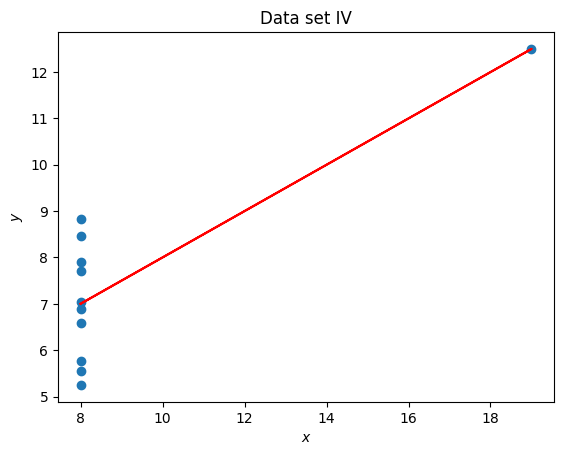
Anscombe’s quartet is often used to demonstrate the importance of visualising data. In this particular exercise we have seen that 4 data sets have the same mean, standard deviation and line of best fit but are immediately different which is clear once visualised.
Important
In this chapter we have:
Plotted a scatter plot.
Add a plot of a line to our scatter plot.