Drawing radar plots in LaTeX with tikz
In this blog post I’ll show some LaTeX code (tikz) for drawing radar plots.
I’m currently in Windhoek for PyCon Namibia and I’m giving a talk entitled “Four stories: four models of learning Python”. In this talk I discuss 4 different classes and I wanted a nice diagrammatic way of representing the differences of these classes (what are the goals, how many students etc…).
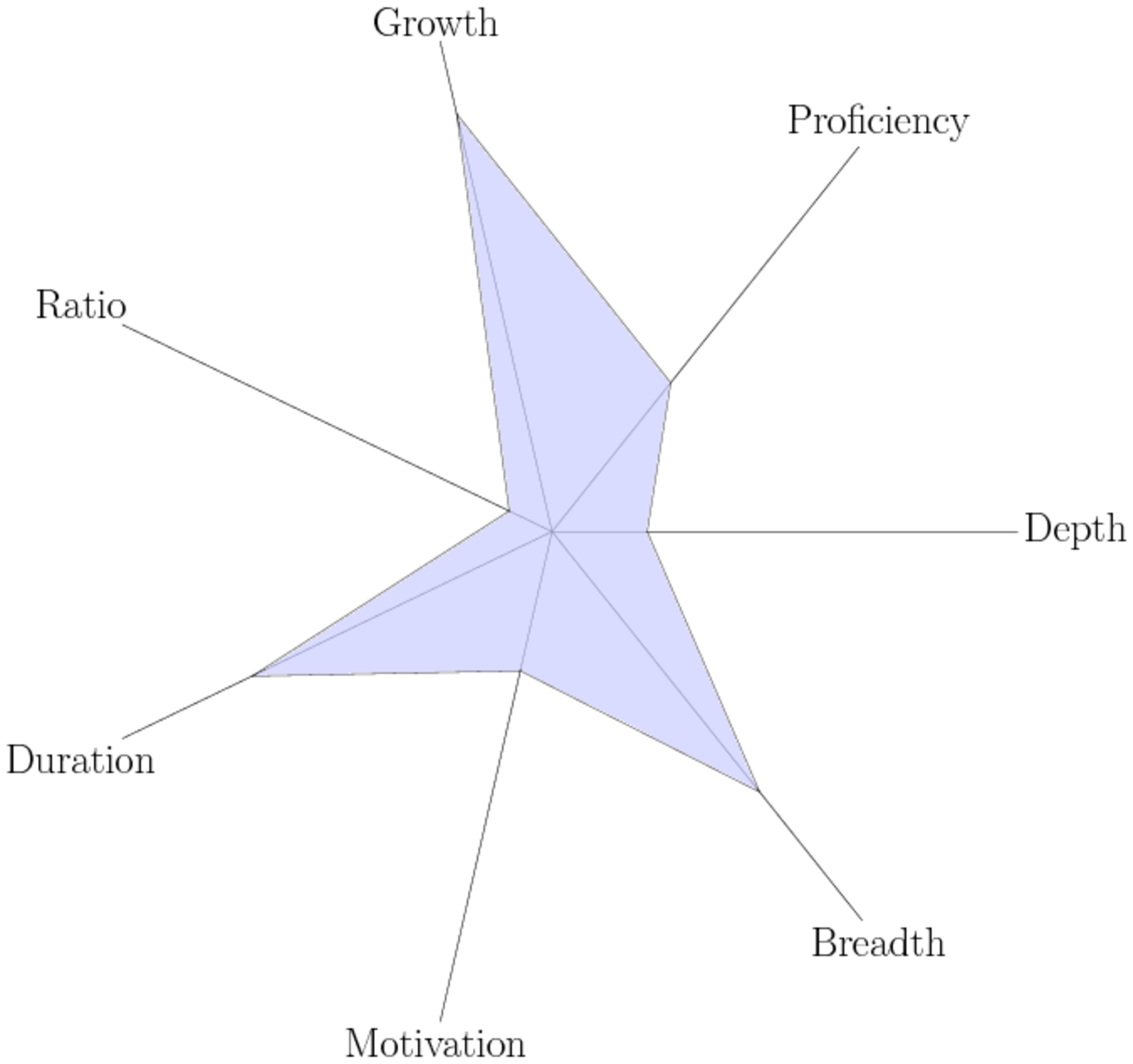
Here’s an example of one of these:

Here is the tikz code to create it:
\begin{tikzpicture}
    \coordinate (origin) at (0, 0);

    \foreach[count=\i] \radius/\dim in {4/Proficiency,
                                        9/Growth,
                                        1/Ratio,
                                        7/Duration,
                                        3/Motivation,
                                        7/Breadth,
                                        2/Depth}{
        \coordinate (\i) at (\i * 360 / 7: \radius);
        \node (title) at (\i * 360 / 7: 11) {\Huge\dim};
        \draw (origin) -- (title);
    }

    \draw [fill=blue!20, opacity=.7] (1)
                                \foreach \i in {2,...,7}{-- (\i)} --cycle;
\end{tikzpicture}
That’s making use of tikz’s for loops \foreach and it’s ability to directly
use polar coordinates at (\i * 360 / 7: \radius) to ensure we get a nice
“regular” star.
Note: star maps are not a great visualisation tool in general but for my purposes of an approximative “picture” of a class they worked well. It’s also a good reason why I’m drawing them in tikz and not some data driven language (because they’re a picture and not representation of actual data).
If you’re interested here is the matplotlib code to draw these in Python:
https://matplotlib.org/examples/api/radar_chart.html.