My thoughts on plotly (the github for plots)
A while ago I saw plotly appear on my G+ stream. People seemed excited about it but I was too busy to look at it properly and just assumed: must be some sort of new matplotlib: ain’t nobody got time for that!
Then, one of the guys from plotly reached out saying I should take a look. I took a brief glance and realised that this was nothing like a new matplotlib and in fact looked pretty cool. So I dutifully put it on my to do list but very much near the bottom.
I’m writing this sat in between sessions at PyconUK 2014. One of the talks on the first day was by Chris from plotly. He gave a great talk (which once the video link is up I’ll share here) and I immediately threw ‘check out plotly’ to the top of my to do list.
How I got started
- I created an account at https://plot.ly/;
- I copied and pasted the code from the ‘getting started guide’ which takes you threw setting up your plotly credentials etc…
- I ran the matplotlib code https://plot.ly/matplotlib/. Which if you look carefully basically is just matplotlib code with an added line
plot_url = py.plot_mpl(fig):
import matplotlib.pyplot as plt
import matplotlib.mlab as mlab
import numpy as np
import plotly.plotly as py

n = 50
x, y, z, s, ew = np.random.rand(5, n)
c, ec = np.random.rand(2, n, 4)
area_scale, width_scale = 500, 5

fig, ax = plt.subplots()
sc = ax.scatter(x, y, c=c,
                s=np.square(s)*area_scale,
                edgecolor=ec,
                linewidth=ew*width_scale)
ax.grid()

plot_url = py.plot_mpl(fig)
That code automatically creates the following plotly plot (which you can edit, zoom in etc…):
By ‘automatically’ I mean: ‘opens up web browser and your plots is there’!!
Doing something of my own
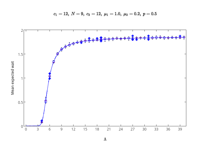
In my previous post I wrote about how to use Markov Chains to obtain the expected wait in a tandem qeue. Here’s a plot I put together that compared the analytical values to simulated values:
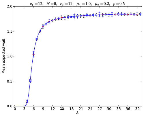
The code to obtain that particular plot is below:
# Libraries
from matplotlib.pyplot import plt
import csv
import plotly.plotly as py

# Get parameters

c1   = 12
N    = 9
c2   = 12
mu_1 = 1
mu_2 = .2
p    = .5

# Read analytical data
analytical_data = [[float(k) for k in row] for row in csv.reader(open('analytical.csv', 'r'))]

# Read simulation data
simulation_data = [[float(k) for k in row] for row in csv.reader(open('simulated.csv', 'r'))]

# Create the plot

fig = plt.figure()
ax = plt.subplot(111)
x_sim = [row[0] for row in simulation_data[::10]]  # The datasets have more data than I want to plot so skipping some values
y_sim = [row[1:] for row in simulation_data[::10]]
ax.boxplot(y_sim, positions=x_sim)
x_ana = [row[0] for row in analytical_data if row[0] <= max(x_sim)]
y_ana = [row[1] for row in analytical_data[:len(x_ana)]]
ax.plot(x_ana,y_ana)
plt.xticks(range(0,int(max(x_ana) + max(int(max(x_ana)) / 10,1)), max(int(max(x_ana)) / 10,1)))
ax.set_xlabel('$\Lambda$')
ax.set_ylabel('Mean expected wait')
title="$c_1=%s,\; N=%s,\; c_2=%s,\;\mu_1=%s,\; \mu_2=%s,\; p=%s $" % (c1, N, c1, mu_1, mu_2, p)

# Save the plot as a pdf file locally
plt.title(title)
plt.savefig("%s-%s-%s-%s-%s-%s.pdf" % (int(c1), int(N), int(c1), mu_1, mu_2, p), bbox_inches='tight')

# THIS IS THE ONLY LINE THAT I HAD TO ADD TO GET THIS UP TO plotly!
plot_url = py.plot_mpl(fig)
If you’d like to repeat the above you can download the analytical and simulated datafiles.
The result of that can be seen here:
Further more that is just a ‘thing’ on my plotly profile so you can see it at this url: https://plot.ly/~drvinceknight/2.
Getting other formats
On that page I can tweak the graph if I wanted to and finally I can just grab the plot in whatever format I want by simply adding the correct format extension to the url:
- pdf: https://plot.ly/~drvinceknight/2.pdf
- png: https://plot.ly/~drvinceknight/2.png
- svg: https://plot.ly/~drvinceknight/2.svg
My overall thoughts
So right now I’m just kind of excited about the possibilities (too many ideas to coherently filter out the good ones), there are also packages for R so I might try and get my students to play around with it in R when I teach it…
As a research tool, I think this will also be nice (it’s certainly the way to go). Although recently, I’ve been working remotely with two students and being able to throw a png of a plot in a hangout chat is pretty cool (and mobile friendly). So maybe that’s something the plotly guys could think about…
At the end of the day: this is an awesome tool. Plotly ‘abstractifies’ plots so that people using different packages/languages can still talk to each other. One of the big things I’m forgetting to talk about in detail is that there’s a web tool that allows you to change colors, change titles, mess with the data etc. That’s also a very cool collaborative tool obviously as I can imagine throwing up a plot that a co-author who doesn’t like code could then tweak.
Similarly (if/when) publications start using smarter formats (than things that are restricted by the need to be printed on paper) you could even just embed the plots like I’ve done here (so people could zoom, grab the data etc…). Here’s another way I could put that:
Papers are where plots go to die, they can go to plotly to live…
Woops, I’ve started blurting out some ideas… Hopefully they’re good ones.
I look forward to playing around with this tool some more (I need to see how it behaves with a Sage plot…).